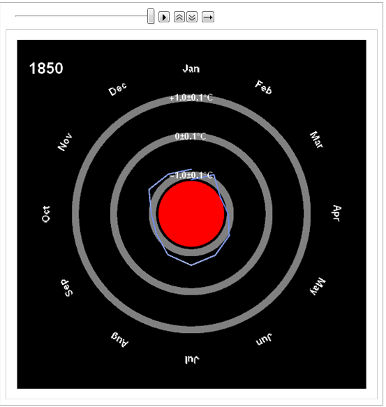
I saw this post on the Wolfram blog.
I’ve enhanced the code to show some error bar indicators and visualized by year w/o the obfuscation of accumulation over time. It also uses parallel CPUs and binary packed arrays to speed up the computation. I also reduced the scale from +2.5C to +1C (since there was no data above it). I wonder if that anomalously larger scale was selected to “suggest” a placeholder for future warming (not appropriate as science – but typical for “influencing” public opinion).
I think my presentation more accurately shows that the recent data from the ’00s (with several El Nino’s), mid 40-60’s ocean temp bias adjustment increases, and more recent changes in (space) technology for collecting data may be a (the?) significant root cause for increases in temperature.
That may not be a politically correct thing to suggest – but I will do more work to substantiate based on the statistical analysis of the various data sets….
If you don’t have the Wolfram CDF Player on a non-Chrome browser for interactive UI, you can watch the YouTube video here or see below.


